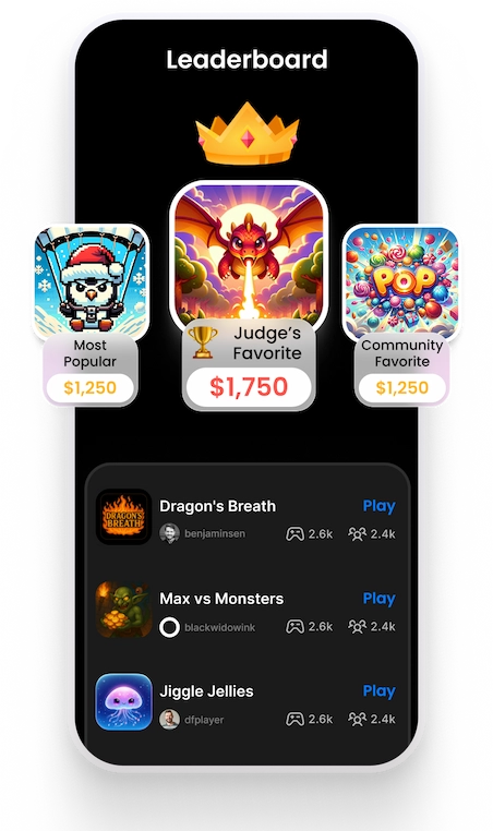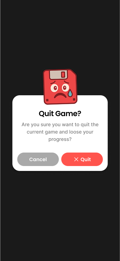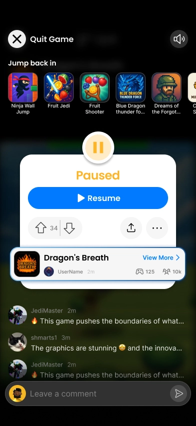

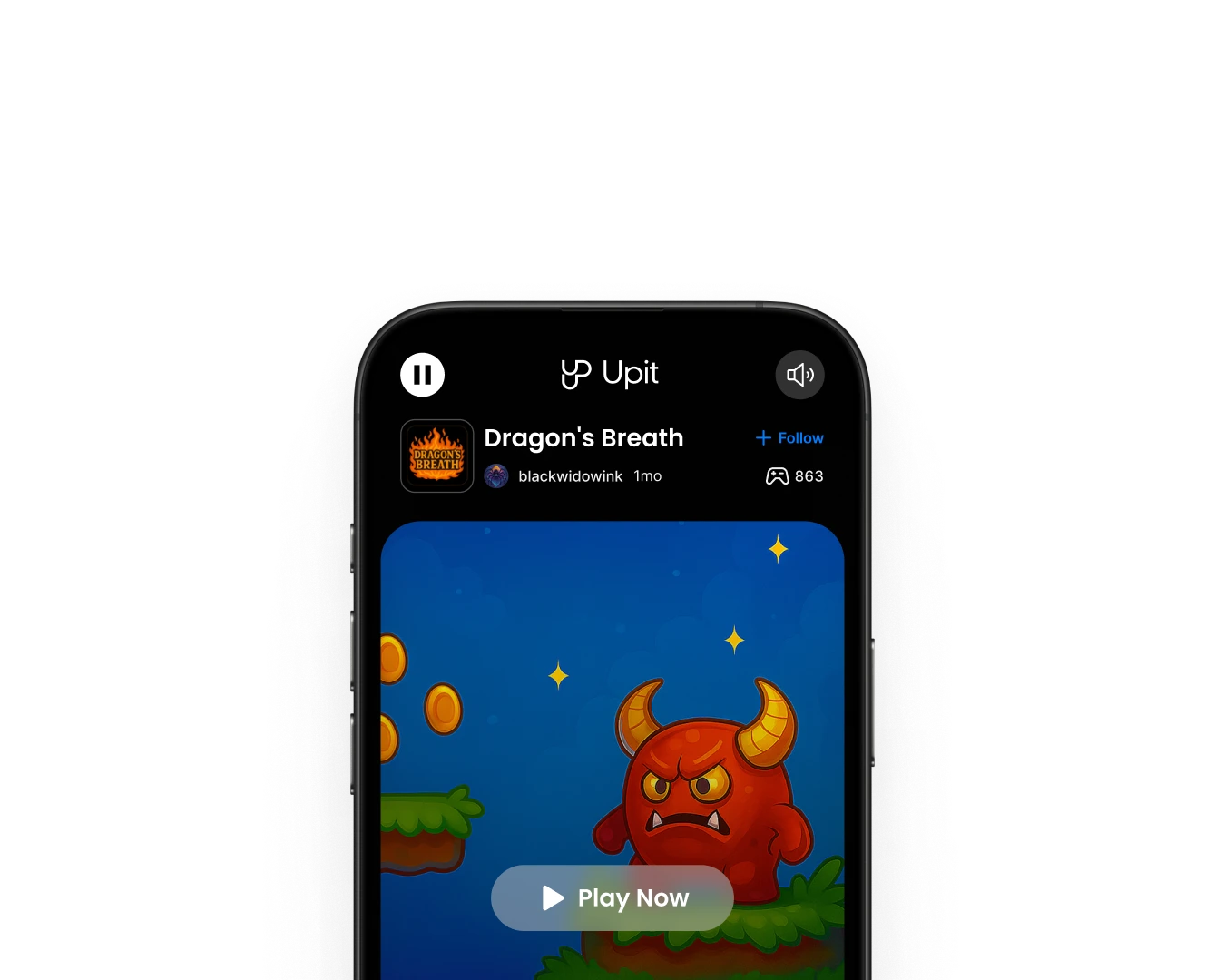
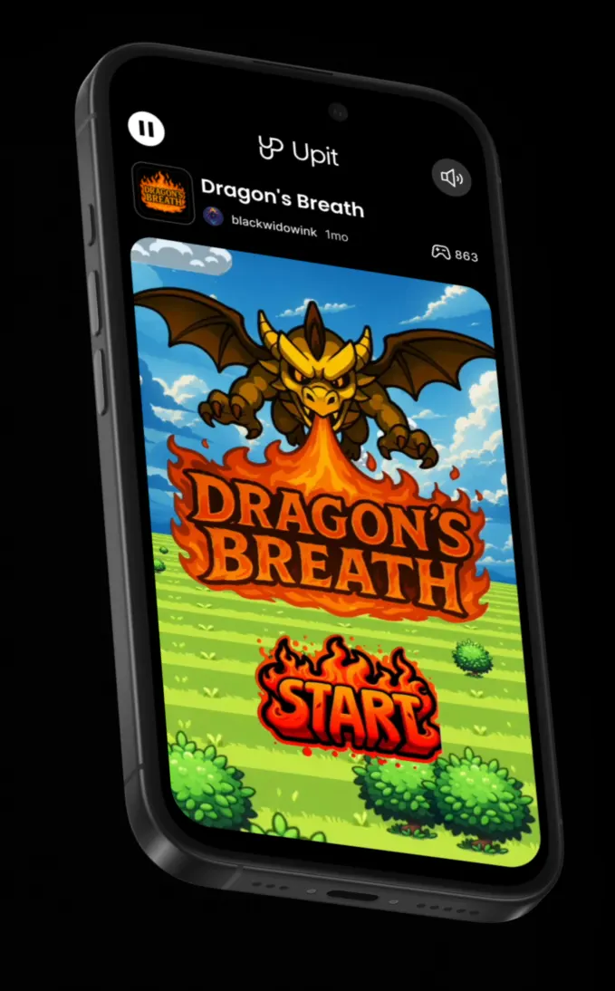
From these insights I defined a set of goals for the new play screen:
I analysed internal data and interviewed both players and creators. The interviews revealed strong motivations: creators wanted recognition and validation, and players enjoyed community connection and challenges (collecting achievements or medals).
I conducted competitive analysis of platforms like TikTok, Roblox and itch.io, showing how social feedback loops (likes, comments, remixes) drive retention. I also analysed the old play experience and mapped out the user journey from finishing a round to leaving the app noticing that the drop‑off after the game‑over screen was steep.
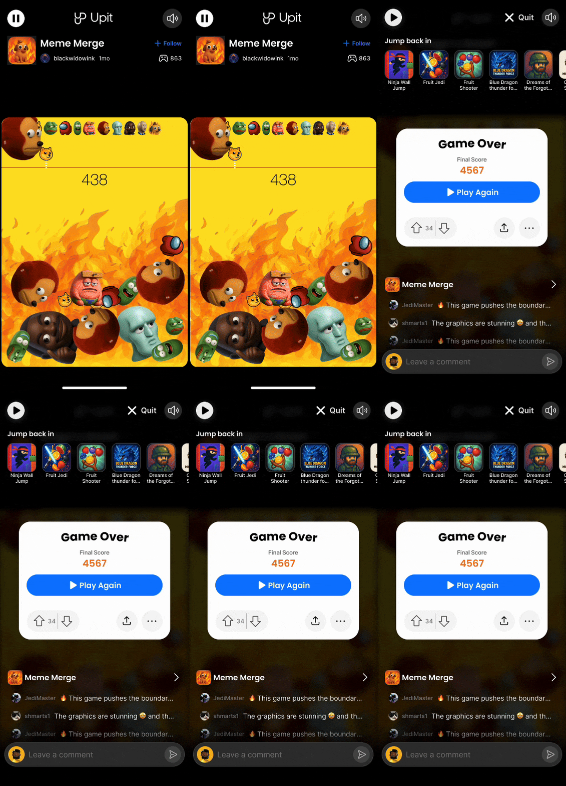
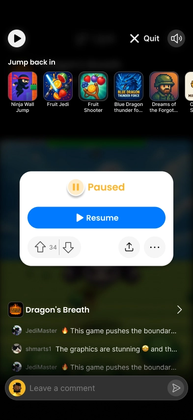
I sketched multiple concepts that combined gameplay with social features. Early wireframes explored modular overlays that could appear at the end of a round: a score summary, quick‑action buttons, a comment feed and a section for remixes.
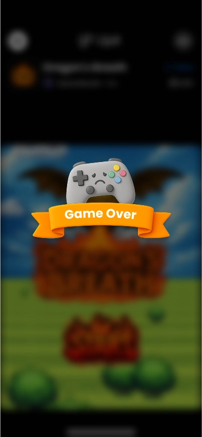
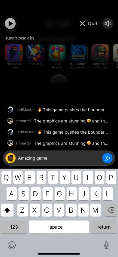
I then built interactive Figma prototypes and ran usability tests with five players and five creators. Players appreciated immediate recognition and the visually appealing banners and icons but were overwhelmed when too many elements appeared at once. Moreover, comments and upvotes needed to be visible in context, burying them behind a tab clearly reduced interaction.
Throughout the design and implementation of the play screen, I worked closely with a diverse, multidisciplinary team, including engineers, designers, and data analysts, to refine the new layouts in response to component limitations prioritising user retention, social engagement and accessibility. Together, we established a comprehensive design system with reusable components for cards, buttons, banners, and lists, which supported rapid iteration and effective cross-functional collaboration.